HOW TO POSTS: LIGHTING AND COMPOSITION
examples of rule of thirds in photography
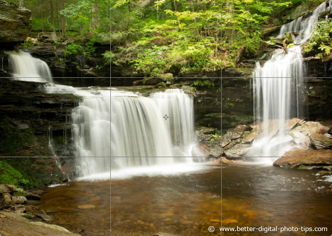
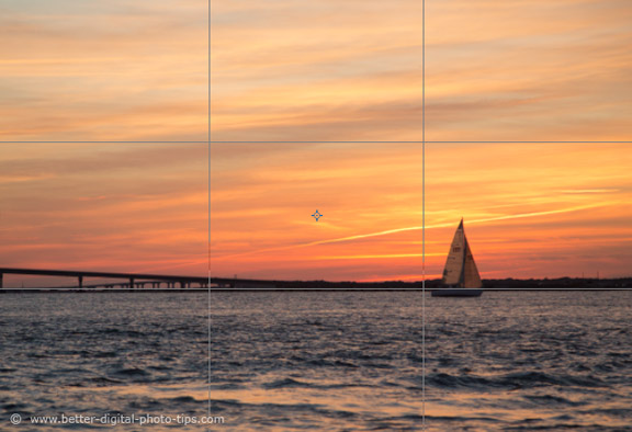
Here are some more examples of rule of thirds in photography. I added an overlay grid to these first two photos to show how the rule of thirds was used.
The photo below is an illustration of a situation where photographers often make one of the most common photography mistakes, a composition that involves the horizon.
It's almost always a bad idea to have the horizon divide your photo into two equal halves. Instead I used the horizon and divided by a third as well as place the sailboat 1/3 of the way to the right.
I placed the horizon on the bottom third of the photo to put the emphasis on the sky, which was more interesting than the water in this case.
Here's an example below of how you can create balance in the composition of your image even if it's an abstract photo. The bottom third is slightly thicker than each of the top 2 thirds, but that's okay because it acts like a base for the rest of the photo to sit on.
comparison photo examples of rule of thirds in photography
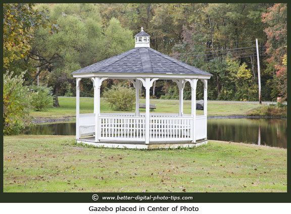
The photo below is rather symmetrical and not a great composition. Don't get me wrong. It's not a terrible composition, it's just a little too static. It has some interesting early Fall colors and pleasant reflections in the calm water.
One of the purposes of this web site is to get you to look for ways to improve your photography as you shoot them. If the main purpose of the photo is to get a real good look at the Gazebo, then this is a better photo than the one farther below where I used the rule of thirds.
I backed off a bit with the zoom and aimed the camera a bit more to the right. This made the stream a leading diagonal line coming in from the right and leading our eye to the Gazebo.
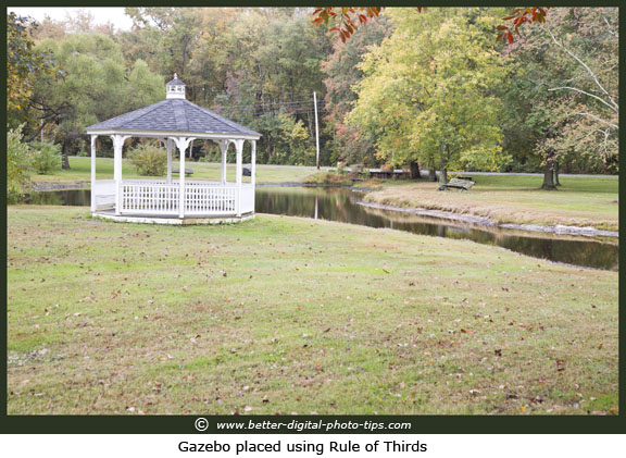
This example was shot in early Fall in the northeast part of the U.S.A. and the tree colors were not yet fully pronounced. It was a dull, overcast day with flat lighting so these are not great photos by any means.
You may not be able to control everything in your photography, but can often do several things that will produce a better photograph and using good compositional technique is one of them.
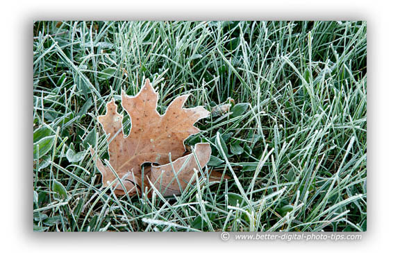
I was just walking around my neighborhood early one chilly morning with my Canon 5d Mark iii attached to my Rocketfish RF-TRP47C carbon fiber tripod and saw this frosty leaf and grass.
I am a nature geek and often am fascinated by the simple things. I thought it was very interesting how the frosty water crystals formed around the edge of this oak leaf.
Naturally without thinking, I composed the photo by placing the leaf at the approximate intersection of those two vertical and two horizontal lines that divide the camera frame in thirds.
Here's another rule of thirds example. You can get some really interesting compositions by zooming in your subject. Emphasize the brilliant colors of the peacock by filling your frame and including no background.
Although his neck is almost perfectly centered, the tilt of his head make it work. Technically, this is not an exact use of the rule of thirds. You, as the creative artist, have the power to adjust the exact placement of your main subject where it "feels right."
If I had place the peacock's head exactly at the rule of thirds intersection, the photo would not have had good balance. It's a very objective rule that should be used subjectively.
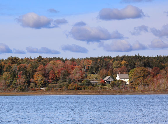
In the loose application of the rule of thirds example below, you can see that the 3 areas of the photo are not exactly at the 1/3 distances. I felt that the location and size of the clouds directed me to compose the photo as I did rather than strictly following a rule of composition.
rule of thirds definition
I did a search on Google and here was one of the top responses on the rule of thirds definition:
The rule of thirds is applied by aligning a subject with the guide lines and their intersection points, placing the horizon on the top or bottom line, or allowing linear features in the image to flow from section to section.
Here's another sample photo of the rule of thirds in a composition. I was most intrigued by the reflection of the flag in the window on the front door. I had to wait patiently until the window had it blowing in just the right manner.
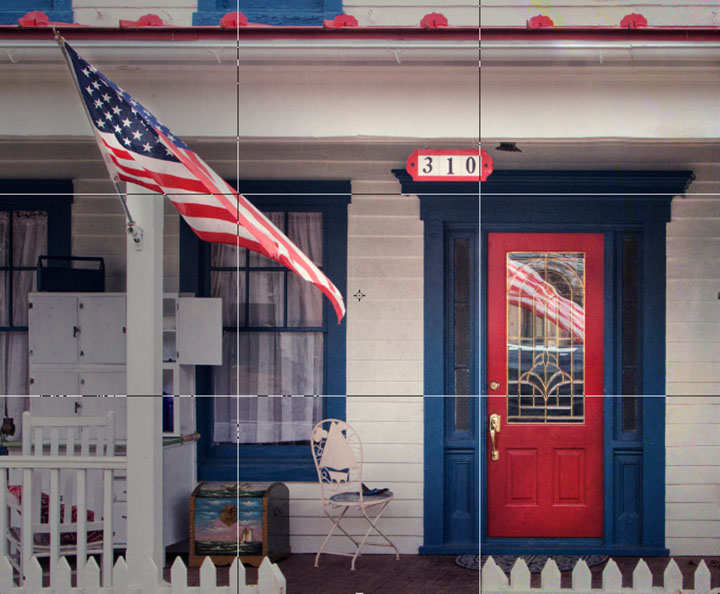 "Patriotic Porch"
The main subjects, the flag and the red door, were placed at the intersection of the horizontal and vertical guidelines.
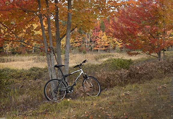
Be flexible if you apply the rule of thirds with your photos. It's a guideline worth using up to a point. In the example below the horizon, where the distant trees meets the tall grass is in the middle of the composition. That's often a less than ideal location for the horizon.
I chose to place the bike near, but not exactly at the 1/3 intersection in the bottom left. I hope these examples were helpful and gave you some ideas on how to apply a common compositional rule.
Cheers!


ABOUT BRUCE LOVELACE
Bruce is the publisher of this website. He is the author of the book "Improve Your Photography Instantly." Read more on Bruce on his Bio Page. He's been known as The Traveling Photographer ever since 1994. Read more about this website.
View some of Bruce's photos on Instagram. Visit the Facebook Page. Watch him on YouTube. Bruce runs photo workshops for kids and adults, and provides one-on-one photography coaching.
Digital Photography Education Location on Google My Business
